Asnaan Dental Clinic’s Landing Page Redesign

Task

Full Landing Page Redesign, UX Audit, Visual Redesign & Conversion Optimization

  • Design

    UI/UX Design

  • Client

    Premium dental care

  • Tools

    Figma,Miro

Project Overview


Client: Asnaan Dental Clinic (أسنان) — A premium dental care provider in Kuwait, operating since 2008, offering specialist-level dental services developed in partnership with American university programs.

Project Type: Full Landing Page Redesign — UX Audit, Visual Redesign & Conversion Optimization

Designer: thedan.design (UI/UX Design Agency)

Tools Used: Figma (Auto Layout, Components, Design System)

Design Scope:

  • Complete visual and structural overhaul

  • Hero section, testimonials, gallery, team, appointment form, and footer

  • Mobile-first responsive layout strategy

  • Conversion-focused UX architecture

The Core Challenge: Asnaan had built a strong clinical reputation over 15+ years. But their landing page was not communicating that authority. Visitors landed on a page that felt visually disconnected, structurally flat, and lacked the persuasive flow that turns curiosity into booked appointments. The redesign mission was clear: build a landing page that converts like it was designed for growth.

Asnaan Dental Clinic — Landing Page Redesign

The Problem with the Original Landing Page

When we first opened the original Asnaan landing page design in Figma, the issues were immediately apparent — not just visually, but strategically.

The original design was built on a white (#FFFFFF) background canvas at 1506px wide — a non-standard desktop width that already suggested the layout had not been optimized for modern screen standards. The hero section opened with large, decorative geometric shapes — a bold diagonal blue polygon and a yellow/gold triangle — that dominated the visual real estate without communicating any core service value.

The headline read “أهلاً بك في أسنان” (Welcome to Asnaan) — pleasant but generic. There was no clear value proposition above the fold. No emotional hook. No compelling reason for a first-time visitor to keep reading.

The CTA button “اقرأ المزيد” (Read More), arguably the most important interactive element on any landing page, was a single modest blue button tucked below a dense paragraph of body copy. It was neither urgent nor action-oriented. A prospective patient ready to book an appointment had no clear next step.

Further down the page, the testimonials section (“مشاهير أسنان” — Asnaan Celebrities) presented large, full-bleed portrait photos of influencers and public figures. While social proof through celebrity endorsements is powerful, the execution lacked structure — no written reviews, no star ratings, no patient outcomes. Visitors saw faces, not evidence.

The gallery section used a collage-style mosaic layout that felt unorganized. There was no Before/After comparison, arguably the single most persuasive content type in dental marketing, anywhere on the page.

The appointment form section existed, but its placement deep in the scroll journey meant most visitors would never reach it. The form itself lacked urgency or context, no trust signals, no indicators of response time, no reassurance copy.

The footer and navigation offered minimal structure, and the overall page lacked a consistent visual language, typographic hierarchy, or spacing rhythm that builds subconscious trust in a brand.

UX Audit & Key Issues Found

After a thorough UX audit of the original design, we categorized the critical issues into five problem areas:

🔴 Issue 1: No Clear Value Proposition Above the Fold

The hero section opened with decorative geometry rather than a patient-centric message. First-time visitors couldn’t immediately understand what Asnaan specializes in, who they serve, or why they’re different from any other clinic. The first 5 seconds of a landing page visit determine whether a user stays or bounces — and the original design failed this test.

🔴 Issue 2: Weak CTA Architecture & Placement

“اقرأ المزيد” (Read More) is an informational CTA, it does not drive appointments. There was only one CTA button on the entire page, buried below a long paragraph. Conversion-optimized pages use multiple CTAs at strategic scroll depths, each aligned with the user’s intent at that moment.

🔴 Issue 3: Unstructured Trust Signals

Celebrity endorsements were presented as large photos without context. Modern users expect verified proof: written testimonials, star ratings, patient names, and treatment outcomes. Without these, the social proof section felt decorative rather than persuasive.

🔴 Issue 4: Missing Before/After Proof, The #1 Converter in Dental Marketing

For a dental clinic, before/after transformations are the most powerful conversion tool available. The original design had no before/after comparisons, a major missed opportunity that left patients unable to visualize their own potential results.

🔴 Issue 5: No Visual Hierarchy or Design System

The original layout used inconsistent spacing, mixed typographic weights without hierarchy, and decorative shapes that competed with content rather than supporting it. There was no component system, meaning the design felt ad-hoc rather than professional. First impressions in healthcare are critical; a disorganized visual language erodes trust before a single word is read.

🔴 Issue 6: Doctor Credibility Not Established

The “Our Team” section existed but lacked structured doctor profiles with specialties, credentials, ratings, and patient review counts. For a healthcare service, trust in the individual practitioner is as important as trust in the brand. The original design treated doctors as afterthoughts.

🔴 Issue 7: Non-Standard Page Width (1506px)

The 1506px frame width does not align with modern web standards (1440px is the industry standard for wide desktop layouts). This mismatch suggests the design was not built with a responsive grid system, increasing the risk of layout breakage across screen sizes.

Redesign Strategy

Before opening a single frame in Figma, we defined our strategic framework. Every design decision made in the redesign had to answer three questions:

  1. Does this build trust?

  2. Does this guide the user toward booking?

  3. Does this communicate Asnaan’s 15+ years of expertise?

Design Thinking Framework Applied:

Empathize: We modeled the mental state of Asnaan’s target visitor — a Kuwaiti resident anxious about dental care, seeking a credible, experienced, aesthetically modern clinic. Fear of dental procedures combined with desire for a beautiful smile. This person needs reassurance before they’ll take action.

Define: The core UX problem was a lack of trust architecture. The page had to move from decorative to persuasive.

Ideate: We explored multiple directions, minimal white-space clinical layouts, warm lifestyle photography approaches, and modern dark-premium themes common in high-end medical branding.

Prototype: We selected the dark navy premium theme, which communicates authority, sophistication, and clinical excellence, a common visual language in elite dental and cosmetic surgery brands globally.

Test (Design Validation): Every section was pressure-tested against conversion principles: Is the hierarchy correct? Is the CTA visible? Does social proof appear at the right scroll depth?


Strategic Pillars of the Redesign:

  • Authority-First Visual Identity, Dark navy + white + yellow accent communicates premium clinical trust

  • Proof-Led Storytelling, Lead with patient outcomes (before/after), then support with credentials

  • Multi-CTA Conversion Funnel, Map CTAs to user intent at each scroll stage

  • Doctor-Led Trust, Elevate the medical team with structured profiles and verified ratings

  • Modern RTL-Optimized Layout, Proper Arabic typography and directional layout for the Kuwait market

Before vs After Improvements

Here is a side-by-side breakdown of every major design decision that changed between the original and redesigned landing page:


Design Element Before After
Background / Theme White (#FFFFFF), flat Dark navy (#1E1E2E–#0A0A1A), premium
Page Width 1506px (non-standard) 1440px (industry standard)
Hero Headline Generic welcome message Emotionally resonant value proposition
Hero Visual Decorative geometric shapes Real team photos in dynamic collage layout
Primary CTA “Read More” (informational) Direct appointment/action CTA
CTA Count 1 CTA on entire page Multiple CTAs at strategic scroll depths
Social Proof Celebrity photos only, no text Verified written testimonials with names + star ratings
Before/After Gallery Not present Interactive before/after photo sliders
Doctor Profiles Basic group photo Individual profiles: name, specialty, ratings, review count
Trust Signals Decorative Star ratings, review counts, accreditation copy
Layout System Manual, inconsistent spacing Auto Layout Figma system, 8pt grid
Color System Ad-hoc blue + yellow shapes Systematic: Navy (primary), White (text), Yellow (CTA accent)
Typography Mixed weights, low hierarchy Clear H1 → H2 → Body → Caption hierarchy
Navigation Basic flat nav Structured sticky nav with clear sections
Appointment Form Deep in page, no context Positioned strategically with trust copy
Footer Minimal Full footer with logo, links, contact

Key UX & Conversion Enhancements

✅ Enhancement 1: Hero Section, Authority in 5 Seconds

The redesigned hero opens with a dark navy background and a carefully composed collage of real team and patient photos, immediately signaling a modern, people-centered clinic. The headline is written to communicate the clinic’s value proposition rather than just saying “welcome.” The layout is structured so that the eye naturally moves from the headline → supporting copy → CTA button.

Why this matters: Nielsen Norman Group research shows users decide within 3–5 seconds whether to stay on a page. A visually authoritative hero with a clear value proposition dramatically reduces bounce rate.

✅ Enhancement 2: Before/After Transformation Sliders

The redesign introduces interactive before/after photo comparison sliders, showing real patient smile transformations. This is the single highest-converting content format in dental marketing because it allows prospective patients to emotionally project themselves into the outcome.

Conversion impact: Before/after sliders on healthcare landing pages are consistently associated with longer engagement times and lower bounce rates.

✅ Enhancement 3: Structured Social Proof Cards

Instead of celebrity photos without context, the redesign introduces clean testimonial cards featuring: a patient photo, their full name, a detailed written review in Arabic, and a star rating. This is structured social proof, the kind that Google and human psychology both trust.

✅ Enhancement 4: Doctor Profiles with Verified Ratings

The team section was completely rebuilt. Each doctor card now displays: their professional photo, full name (e.g., “د. عبدالوهاب الكندري”), specialty, a 5-star rating system, and a review count (e.g., “4.9/5.0 (46 reviews)”). This is the trust architecture of platforms like Zocdoc and Healthgrades — it works because it reduces uncertainty.

✅ Enhancement 5: Yellow CTA Conversion Section

A dedicated full-width CTA section was added, warm yellow background with a professional doctor photograph and a clear action button. This breaks the dark theme intentionally, creating a visual “stop” moment that draws the eye and prompts action at the exact moment trust has been fully established through the preceding sections.

Expected Business Impact

Based on established UX research benchmarks and conversion optimization principles, the Asnaan landing page redesign is expected to deliver the following business outcomes:


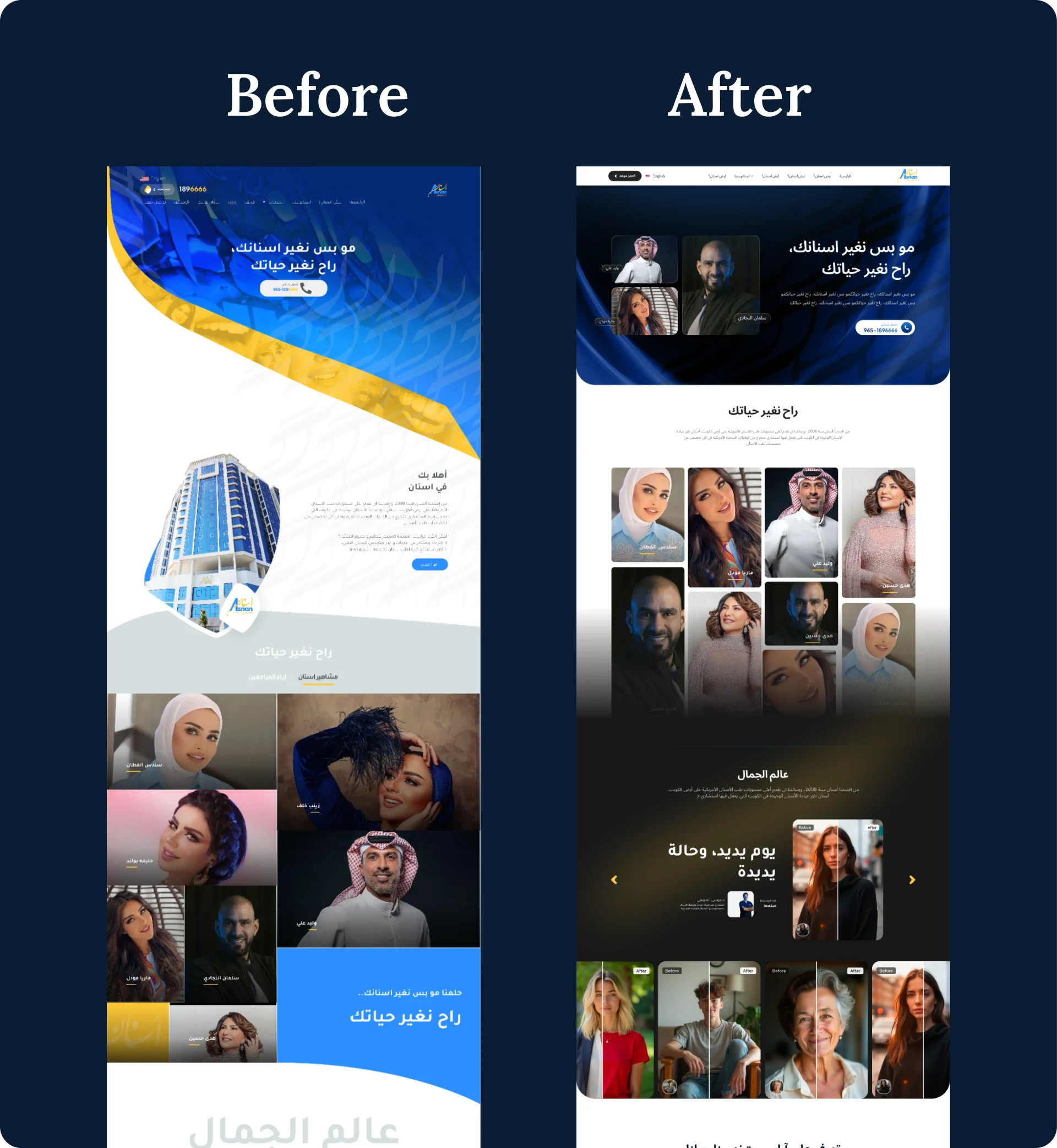
📈 Increased First Impression Trust Score

The shift from a white, decoration-heavy layout to a dark, professional, content-led design immediately places Asnaan in the premium dental brand category, reducing the cognitive effort required for a visitor to decide to trust the clinic.


📈 Higher Engagement Time (Lower Bounce Rate)

Before/after sliders and structured testimonial cards are proven engagement drivers. Users who interact with before/after content spend 2–3× longer on the page, significantly increasing their likelihood of conversion.


📈 More Appointment Bookings

With multiple CTAs placed at intent-aligned scroll depths, and a strategically positioned appointment form supported by trust signals, the path from “interested visitor” to “booked patient” has been shortened and clarified.


📈 Improved Doctor Authority = Higher Willingness to Book

Structured doctor profiles with ratings and review counts directly address the #1 anxiety of healthcare consumers: “Is this doctor qualified and trusted by others like me?” Resolving this anxiety earlier in the scroll journey means users reach the appointment form already pre-convinced.


📈 Better SEO Signals

A well-structured page with clear heading hierarchy, fast-loading organized sections, logical content flow, and lower bounce rate sends positive UX signals to search engines — contributing to improved organic rankings for dental service keywords in Kuwait.


📈 Brand Elevation

The redesigned visual identity positions Asnaan as a premium dental brand, not just another clinic. This perception premium allows for higher service pricing authority and attracts quality patients who value expertise.


Final Thoughts


The Asnaan landing page redesign is a clear example of what happens when you treat a landing page as a conversion machine rather than a digital brochure.

The original design wasn’t bad because it lacked effort, it was underperforming because it was built without a conversion strategy. Every element existed, but none of them worked together to guide the visitor through a trust-building journey toward booking an appointment.

The redesign changed everything by asking a simple question before every design decision: “Does this move the user one step closer to saying yes?”

  • A dark, authoritative hero says: This clinic is premium. I can trust them.”

  • Before/after sliders say: I can see what’s possible for me.”

  • Testimonials with names and ratings say: Other people like me have had great experiences.

  • Doctor profiles with reviews say: The professionals here are excellent and verified.

  • A bold CTA section says: Now is the time. Here is exactly what to do.

That is the anatomy of a landing page that converts.


Is your landing page losing potential customers without you knowing it?

At thedan.design, we specialize in UX-driven landing page redesigns that turn underperforming websites into conversion engines for startups, clinics, SaaS products, and service businesses.

📩 Let’s talk about redesigning your landing page, thedan.design

Back

This website stores cookies on your computer. Cookie Policy