HelloUI Design System – for SaaS & Enterprise Products

Task

Create a comprehensive, production-ready Figma design system that enables SaaS startups and enterprise product teams to ship consistent, accessible, and scalable user interfaces without building design infrastructure from scratch. The system needed to provide designers and developers with a complete foundation of tokens, components, and patterns covering complex data-heavy applications, from simple forms to advanced tables, multi-level navigation, and sophisticated feedback mechanisms, all optimized for light and dark themes.

  • Design

    Design Systems, UI/UX Design

  • Client

    SaaS & Enterprise Product Teams

  • Tool

    Figma

Project Overview

The HelloUI Design System is a mature, production-grade Figma design system specifically architected for complex SaaS dashboards, internal tools, and enterprise applications. This comprehensive system goes beyond surface-level UI kits by providing a robust foundation of design tokens, 60+ components organized across functional domains, and a scalable structure that supports multi-team product organizations.

The system serves as a critical accelerator for product teams who need to move fast without sacrificing consistency, accessibility, or professional polish. Unlike lightweight UI kits focused on marketing pages, HelloUI is built for the real challenges of B2B products: dense data tables, complex form workflows, hierarchical navigation, and sophisticated state management across light and dark themes.

For founders and product leaders, HelloUI eliminates months of design infrastructure work, enabling teams to focus resources on differentiating features rather than rebuilding basic components. For engineering teams, the token-driven architecture and organized component library provide predictable patterns that map directly to React, Vue, or web component implementations.

Key Features & Design Solutions

🎹 Token-Driven Foundation System

A comprehensive design token architecture using Figma Variables that powers the entire component library. The foundation includes structured color palettes (Base Color Palettes, Neutral Colors, Brand Colors), hierarchical typography styles (Text Base, Text SM, Text LG, Heading), effect styles for elevation (boxShadow variants), and layout grid styles (1440px 12-col and 24-col systems).

The token approach ensures that when brand colors evolve or dark mode ships, updates propagate across the entire system instantly without manual component editing. This architecture mirrors modern CSS custom properties and design token JSON exports, making developer handoff seamless.

đŸ§± Foundation Components Library

Six core primitive components that serve as atomic building blocks for the entire system: Button, FloatButton, Icon, Typography, Divider, and Splitter. These components are designed with extensive variant support covering different sizes (small, middle, large), types (primary, default, dashed, text, link), and states (default, hover, active, focus, disabled, loading) across both light and dark themes.

The Foundation category establishes the visual language and interaction patterns that cascade through more complex components, ensuring consistency at the atomic level.

Foundation Components Library

🧭 Navigation Component Suite

Six specialized navigation components covering the full spectrum of SaaS navigation patterns: Anchor for single-page navigation, Breadcrumb for hierarchical context, Dropdown for contextual menus, Menu for primary and secondary navigation structures, Pagination for data set navigation, and Steps for multi-stage processes.

Each component is designed to work independently or compose together, enabling teams to build everything from simple header navigation to complex multi-level sidebar systems with contextual submenus and active state indicators.

Navigation Component Suite

Advanced Data Input Components

A comprehensive collection of 16 form and input components that go far beyond basic text fields. The library includes sophisticated selectors like AutoComplete with search highlighting, Cascader for hierarchical data selection, TreeSelect for nested options, and Transfer for dual-list selection patterns.

Date and time handling is covered through DatePicker, TimePicker, and Calendar components with range selection and preset support. The system also includes Radio, Checkbox, Switch, Rate, Slider, and Upload components—each with inline validation states, helper text patterns, and error messaging.

This depth is critical for B2B applications where forms drive core workflows: onboarding, settings, filters, and data entry. The components are designed for both simple forms and complex multi-step wizards with conditional logic.

Advanced Data Input Components

Data Display Components for Dense Interfaces

16 components specifically designed for presenting structured information in data-heavy dashboards: Avatar for user representation, Badge and Tag for status indicators, Card for grouped content, Collapse for progressive disclosure, Descriptions for key-value pairs, List for repeating items, and the critical Table component for tabular data.

The Table component represents weeks of design work when built from scratch, including features like sortable columns, row selection, inline editing, expandable rows, and responsive behavior. Other standout components include Statistic for KPI display, Timeline for chronological events, Tree for hierarchical data, Tabs for content organization, and Popover/Tooltip for contextual information.

This category acknowledges that most B2B SaaS products are fundamentally about displaying, filtering, and manipulating structured data—not just marketing content.

Data Display Components for Dense Interfaces

🔔 Feedback & Confirmation Components

Seven components covering both passive feedback and blocking confirmations: Alert for static notices, Message and Notification for transient feedback, Modal and Popconfirm for user decisions, Progress for operation status, and Spin for loading states.

The distinction between non-blocking feedback (dismissible alerts, toast notifications) and blocking confirmations (modal dialogs, popovers) is architecturally significant—allowing designers to choose appropriate patterns based on action criticality and user context.

Feedback & Confirmation Components

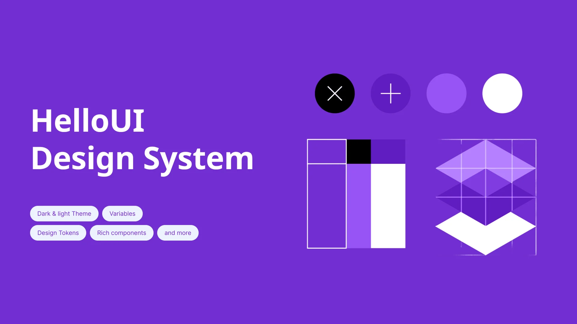
🌗 Native Light & Dark Theme Support

The entire component library is built with dual-theme support using Figma Variables, allowing instant theme switching without rebuilding components. This architecture ensures that text contrast, background surfaces, borders, and interactive states all adapt correctly across themes.​

For SaaS products, dark mode is increasingly table-stakes—especially for tools used during extended sessions or by technical users. HelloUI’s native theme support means teams don’t need to maintain two separate design libraries.


📐 Responsive Grid Systems

Two layout grid styles targeting different use cases: a traditional 12-column grid for balanced, marketing-style layouts, and a 24-column grid for dense dashboard interfaces requiring fine-grained control. Both grids are anchored to a 1440px viewport, the sweet spot for laptop displays used by B2B knowledge workers.

The grid styles provide designers with consistent column widths, gutters, and alignment constraints—ensuring layouts remain cohesive even as product surfaces multiply across teams.

📚 Organized Figma Library Structure

A disciplined page hierarchy that separates concerns and enables efficient navigation: Cover page for introduction, Design Guide for foundational systems (Typography, Colors, Size/Space/Radius, Effects), Foundation for primitives, and dedicated pages for Navigation, Data Input, Data Display, and Feedback components.​

This organization mirrors how mature design systems like Ant Design, Material-UI, and Carbon document components—making HelloUI immediately familiar to designers and developers who have worked with established systems.

Design Approach

The system follows a pragmatic, product-first aesthetic that prioritizes usability and scalability over decorative trends:

  • Semantic Token Architecture: Variables organized by usage intent (backgrounds, borders, text, accents, status) rather than raw color names, enabling context-aware design decisions and simplified theme management

  • Hierarchical Typography System: Four distinct size categories (Text SM, Text Base, Text LG, Heading) that support different information densities—from compact admin tables to spacious onboarding flows—using modern web fonts optimized for screen readability

  • Component Variant Discipline: Systematic variant properties for size, type, state, and theme across all interactive components, reducing one-off detached instances and maintaining library integrity as teams scale

  • Data-Dense Layout Patterns: Thoughtful spacing scales, card-based grouping, and progressive disclosure techniques that present complex information without overwhelming users or creating visual clutter

  • Accessibility Foundations: Text styles enforcing minimum readable sizes, effect styles creating visual hierarchy without color dependence, and structured semantic layers supporting screen reader navigation

  • Developer-Friendly Conventions: Clear naming patterns, organized style categories, and token structures that map directly to CSS custom properties, Tailwind configs, or design token JSON—reducing design-to-code translation friction

User Experience Highlights

The system excels across multiple experience dimensions critical for product velocity:

Adoption Speed: Designers familiar with component-based design can navigate and use HelloUI effectively within hours due to its clear taxonomy and naming conventions that match industry-standard patterns.

Consistency at Scale: By providing a complete component inventory covering 60+ UI patterns, teams avoid the fragmentation that occurs when designers build custom variants for missing pieces—keeping products cohesive even across distributed teams.

Theme Flexibility: Native light/dark theme support through Variables means designs automatically adapt to user preferences or brand changes without manual rework, reducing design and development cycles for theme implementations.

Design-to-Dev Efficiency: Token-driven foundations and systematic variant structures create a shared vocabulary between design and engineering, reducing interpretation errors and back-and-forth during implementation.

Extensibility: The organized structure allows teams to add custom components or variants without breaking existing patterns—critical for companies that need both standardization and domain-specific customization.


Technical Considerations

The design system was architected with modern product development workflows in mind:

Back

This website stores cookies on your computer. Cookie Policy