


Why UX/UI Design Is Critical for Website Success

You Have 0.05 Seconds. Make Them Count.
Here’s a number that should keep every designer, developer, and business owner up at night: users form their first opinion about a website in just 50 milliseconds, which is faster than a single blink. And 94% of those snap judgments are based entirely on visual design, not content.
That means before a visitor reads a single headline, scans a single paragraph, or clicks a single button, they’ve already decided whether they trust you. Your UX/UI design isn’t decoration, it’s the front door, the handshake, and the elevator pitch all rolled into one.
Yet here’s the paradox: 70% of online businesses fail due to bad usability, and only 55% of companies conduct any UX testing before launch. The gap between knowing UX matters and actually investing in it is where billions of dollars in revenue disappear every year, an estimated $2.6 trillion globally.
This article breaks down why UX/UI design is the single highest-leverage investment a business can make in 2026, backed by hard data, real-world case studies, and actionable takeaways you can apply today.
UX vs. UI: Two Sides of the Same Coin
Before diving deeper, it’s essential to understand the distinction and the relationship between these two disciplines.
UX (User Experience) Design governs how a website works. It focuses on user needs, information architecture, navigation flow, and ensuring visitors can accomplish their goals with minimal friction. UX answers the question: “Can the user do what they came here to do, easily and enjoyably?”
UI (User Interface) Design governs how a website looks and feels. It handles typography, color systems, spacing, button styles, icons, and interactive elements. UI answers the question: “Does the interface communicate clarity, trust, and professionalism?”
UX ensures usability. UI ensures credibility. Together, they determine growth.
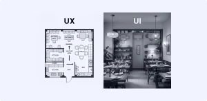
Think of it this way: UX is the floor plan of a restaurant, how tables are arranged, where the kitchen is, how the menu flows. UI is the lighting, the tableware, the music. A beautifully lit restaurant with terrible service won’t get return visits. A well-run kitchen hidden behind an ugly facade won’t get first visits. You need both.
The Business Case: UX as a Revenue Driver
UX design is not a cost center, it’s the most profitable investment most companies will ever make. The data is overwhelming:
| Metric | Impact | Source |
|---|---|---|
| ROI per $1 invested in UX | $100 return (9,900% ROI) | Forrester |
| Conversion rate boost from strong UX | Up to 400% | Forrester |
| Conversion rate boost from good UI | Up to 200% | Forrester |
| Revenue increase from 10% more UX budget | 83% increase in conversions | UXCam |
| Design-driven companies vs. S&P 500 | Outperform by 228% over 10 years | McKinsey |
These aren’t theoretical projections. Real companies have proven this repeatedly. Moz redesigned its sign-up process using UX principles and generated over $1 million in additional revenue while increasing conversions by 52%. SAP BusinessObjects added a single more-prominent CTA button and saw a 32% increase in conversions. Amazon discovered that every 100ms reduction in page load time produced a 1% increase in revenue.
The lesson is clear: small, intentional UX improvements create outsized business results. It’s not about redesigning everything — it’s about fixing the friction points that cost you money every day.

Speed Is Design
Page speed isn’t a technical detail buried in your developer’s backlog. It’s a core UX metric that directly impacts revenue, conversions, and search rankings.
-
53% of mobile visitors abandon a page that takes more than 3 seconds to load
-
Every 1-second delay in load time reduces conversions by 7%
-
Sites loading in 1 second convert 3× better than sites loading in 5 seconds
-
A 1-to-10-second increase in mobile load time leads to a 123% higher bounce probability
-
70% of consumers say page speed affects their willingness to buy
Google has made this a ranking factor, too. Sites meeting Core Web Vitals thresholds (like LCP under 2.5 seconds) rank higher in search results. In 2026, Google evaluates UX signals using a combination of real-world field data and AI-simulated browsing, measuring “journey frustration” indicators like rage clicks, excessive scrolling without engagement, and pogo-sticking back to search results.
The average load time for top-ranking Google pages is just 2.5 seconds. If your site is slower, you’re not just losing users, you’re losing rankings.
Actionable tip: Run your site through Google PageSpeed Insights today. Focus on optimizing Largest Contentful Paint (LCP), Interaction to Next Paint (INP), and Cumulative Layout Shift (CLS). Compress images, defer non-critical JavaScript, and eliminate render-blocking resources.

Mobile-First Isn’t Optional, It’s the Baseline
Over 60% of all global web traffic now comes from mobile devices. Yet only 22% of small business websites are fully mobile-optimized. This gap represents a massive competitive opportunity.
The data on mobile UX is unforgiving:
-
74% of users are more likely to return to a mobile-friendly site
-
67% of mobile users are more likely to buy from a mobile-friendly site
-
57% won’t recommend a business with a poorly designed mobile site
-
Mobile users are 5× more likely to abandon a task if the site isn’t optimized
-
Mobile cart abandonment averages 85.7% vs. 73% on desktop
Google’s index is mobile-first, meaning the mobile version of a site is the site for ranking purposes. A beautiful desktop experience paired with a clunky mobile version will underperform in search, regardless of content quality.
What mobile-first UX actually looks like:
-
Large, thumb-friendly tap targets with adequate spacing between interactive elements
-
Short, scannable text sections, no walls of text
-
Simplified navigation with minimal dropdown layers
-
Fast-loading, compressed images and media
-
Sticky bottom navigation bars or hamburger menus designed for one-handed use
Test your website using one hand on a phone. If it feels cramped, awkward, or slow, improvements are needed.
Trust, Credibility, and the Emotional Layer
Design doesn’t just communicate information, it communicates trustworthiness. 75% of users judge a company’s credibility based on website design alone, and 48% cite web design as the number-one factor in deciding whether a business is credible.
This is especially critical in B2B contexts, where 80% of purchase decisions are driven by customer experience — not price or product features. A well-designed interface signals professionalism, reliability, and attention to detail. A poorly designed one erodes confidence instantly, even if the underlying product or service is excellent.
The emotional dimension of UX is often underestimated. Great design forges an emotional connection with users, telling a story about what a brand stands for through visual language, interactions, and micro-animations. Apple’s website, for example, reflects elegance and innovation through its sleek design and smooth transitions. People who relate to those values feel a natural bond with the brand.
Key trust signals in UX/UI design:
-
Consistent visual language (colors, fonts, spacing) across all pages
-
Professional typography at readable sizes (16px+ for body text)
-
Clear contact information and social proof
-
Secure, well-designed checkout and form experiences
-
WCAG-compliant accessibility (96.3% of top websites still fail basic accessibility checks)

UX Drives SEO in 2026
Search engine optimization is no longer just about keywords and backlinks. In 2026, UX is SEO. Google’s algorithms measure behavioral signals that directly reflect user experience quality:
-
Dwell time: how long users stay on a page
-
Scroll depth: how much content they consume
-
Interaction signals: clicks, taps, and engagement patterns
-
Pogo-sticking: returning to search results immediately (a negative signal)
-
Rage clicks: repeated frustrated clicking on non-interactive elements
These UX metrics create a composite quality score that directly influences rankings. A page that satisfies users quickly and pleasantly is rewarded. A page that forces users to hunt for answers is penalized, regardless of keyword optimization.
This shift moves SEO from “keywords” to “experiences”. Practically, this means:
-
Clean, logical site structure helps both users and search engines
-
Fast loading times improve rankings and user satisfaction
-
Mobile optimization is a ranking requirement, not a bonus
-
Accessible design broadens reach and improves engagement metrics
-
Clear content hierarchy with proper heading structure aids both comprehension and crawlability
Bottom line: Investing in UX/UI design is now one of the most effective SEO strategies available. The websites that rank highest are those that provide the best experiences.
Accessibility: The $13 Trillion Opportunity
Designing for accessibility isn’t just ethically right, it’s a significant business opportunity. 1.3 billion people worldwide live with a disability, representing a $13 trillion annual market. Yet 96.3% of the top 1 million websites have detectable accessibility failures, and 71% of users with disabilities leave an inaccessible website immediately.
The most common issue? Low color contrast, responsible for 53% of accessibility failures and fixable in minutes. Beyond compliance, accessible design improvements benefit all users: better readability, clearer navigation, and more intuitive interactions lift the experience for everyone.
Accessibility audits using WCAG 2.2 standards should be part of every design and development process. Businesses that get this right gain access to an underserved market while building a more robust, user-friendly product for all visitors.
A Practical UX/UI Checklist for 2026
For business owners, product managers, and design teams looking to take immediate action:
-
Audit your page speed: target under 2.5 seconds for LCP, use PageSpeed Insights
-
Test on mobile: one-hand test on 3+ device sizes; ensure tap targets are at least 48×48px
-
Simplify navigation: reduce dropdown layers; aim for 3-click access to any page
-
Strengthen CTAs: specific CTAs increase conversion by 161% vs. vague ones; use action-oriented language and prominent placement
-
Fix accessibility: run a WCAG 2.2 audit; start with color contrast and alt text
-
Reduce form friction: pages with fewer than 5 form fields see 55% more conversions
-
Add white space: 30% more white space increases comprehension by 20%
-
Invest in consistency: unified color, typography, and spacing systems build trust
-
Monitor UX metrics: track Core Web Vitals, bounce rate, session duration, and scroll depth monthly
-
Test with real users: 85% of UX problems surface with just 5 users
The Bottom Line
Every $1 invested in UX returns $100. Design-driven companies outperform the market by 228%. And 88% of users never return after a bad experience.
In 2026, UX/UI design is not a creative preference; it’s a business strategy. The companies that treat design as a core growth lever will outperform those that treat it as an afterthought. The data doesn’t whisper this. It shouts it.
The question isn’t whether your business can afford to invest in UX/UI design. It’s whether you can afford not to.