


The 10 Usability Heuristics Every SaaS Product Needs to Get Right

Ever used a SaaS tool that felt effortless from the very first click? That sense of ease isn’t accidental it’s the result of deeply considered design principles. At the core of nearly every well-designed digital product lies a framework that has stood the test of time for over three decades: Jakob Nielsen’s 10 Usability Heuristics.
Originally developed in 1990 by Jakob Nielsen and Rolf Molich and refined through a factor analysis of 249 usability problems in 1994, these heuristics remain the gold standard for evaluating user interfaces. Whether you’re building a fintech dashboard, a healthcare portal, or a project management tool, these principles serve as your design compass.
Let’s break down each heuristic, explore what it means for your SaaS product, and look at real-world examples you can learn from.
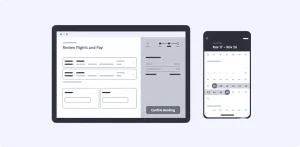
1. Visibility of System Status
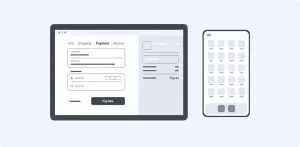
The system should always keep users informed about what’s going on through appropriate feedback within a reasonable time.
Think about the last time you uploaded a file to Google Drive or Dropbox. You saw a progress bar, a spinning indicator, and finally a confirmation. That’s visibility of system status in action.
In SaaS products, latency is the enemy. When a user imports a dataset, triggers an automation, or processes a payment, silence creates anxiety. If users don’t see feedback, they’ll click again, refresh, or worse—assume your product is broken.
How to apply it:
-
Use progress bars, skeleton screens, and loading indicators for any process that takes more than a second.
-
Show real-time status updates for multi-step workflows (e.g., “Step 2 of 4: Verifying your data…”).
-
Confirm completed actions with success states a simple checkmark or toast notification goes a long way.
2. Match Between the System and the Real World
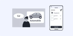
The design should speak the user’s language, not your developer’s.
If your SaaS tool displays “Row Deleted” instead of “Project Removed,” you’re speaking in database terms, not human terms. This heuristic is about using words, phrases, icons, and visual metaphors that feel natural and familiar to your target users.
A folder icon for organizing files, a trash can for deletions, a shopping cart for e-commerce these metaphors tap into real-world mental models and make your interface feel intuitive without a manual.
How to apply it:
-
Conduct user research to discover the terminology your audience actually uses.
-
Replace technical jargon in your UI with plain, task-oriented language.
-
Use icons that correspond to real-world actions your users recognize.
3. User Control and Freedom

Users will make mistakes. Give them a clearly marked emergency exit.
Imagine accidentally deleting a project in your SaaS tool with no way to recover it. That feeling of helplessness breeds frustration and erodes trust. This heuristic demands that users can undo, redo, cancel, and back out of any process easily.
Gmail’s “Undo Send” feature is a textbook example. Slack’s ability to edit or delete sent messages is another. These exits foster a sense of confidence and control.
How to apply it:
-
Support Undo and Redo for destructive actions.
-
Provide clearly labeled Cancel buttons at every stage of a multi-step flow.
-
Allow users to exit modals, pop-ups, and onboarding sequences without being trapped.
4. Consistency and Standards
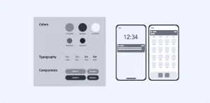
Don’t reinvent the wheel follow established conventions.
Jakob’s Law states that users spend most of their time on other products. Their experience with Notion, Slack, Figma, or Google Workspace sets the standard. If your sidebar navigation, button styles, or interaction patterns deviate from what users expect, you’re adding cognitive load unnecessarily.
How to apply it:
-
Maintain internal consistency: the same action should look and behave the same way everywhere in your product.
-
Follow external conventions: if every SaaS platform uses a gear icon for settings, so should you.
-
Build and maintain a design system to enforce consistency across your product.
5. Error Prevention
The best error message is the one that never shows up.
There are two types of errors: slips (accidental, unconscious) and mistakes (conscious errors from a misunderstanding). Great SaaS design prevents both. Real-time form validation, smart defaults, and confirmation dialogs before irreversible actions are your primary tools.
How to apply it:
-
Use inline validation on forms so users catch errors as they type, not after submission.
-
Provide helpful constraints if a field requires an email, auto-suggest the format.
-
Add confirmation steps before any destructive action (“Are you sure you want to delete this workspace?”).
6. Recognition Rather Than Recall
Don’t make users memorize let them recognize.
Humans have limited working memory. Forcing users to remember an ID number from one screen and type it on another is a failure of design. Good SaaS interfaces keep critical information visible, offer auto-complete suggestions, and display recently accessed items prominently.
How to apply it:
-
Show recently viewed items, saved searches, and favorites.
-
Use contextual tooltips and inline help instead of expecting users to recall documentation.
-
Display relevant information (like field formats and examples) next to input fields.
7. Flexibility and Efficiency of Use
Design for both the newcomer and the power user.
A well-designed SaaS product works for first-time users who need guidance and experienced users who want shortcuts. Keyboard shortcuts, customizable dashboards, and saved templates are all examples of flexibility in action.
Figma nails this: beginners can use the visual toolbar while power users fly through designs with keyboard shortcuts and plugins.
How to apply it:
-
Provide keyboard shortcuts for common actions and let users discover them organically.
-
Allow users to customize their workspace rearrange widgets, pin frequently used features.
-
Offer onboarding that can be skipped or revisited on demand.
8. Aesthetic and Minimalist Design

Every pixel should earn its place.
This isn’t about being “minimalist” for the sake of aesthetics. It’s about ensuring that every element on screen supports the user’s primary goal. Extra information competes with relevant content, reducing its visibility and increasing cognitive load.
Notion’s clean interface is a powerful example it shows you only what you need, exactly when you need it. Contrast that with a cluttered dashboard overflowing with charts, widgets, and notifications competing for attention.
How to apply it:
-
Prioritize content hierarchy ruthlessly what does the user need to see first?
-
Use progressive disclosure: show essential features upfront, and tuck advanced options behind expandable menus.
-
Leverage whitespace strategically to let content breathe and guide the eye.
9. Help Users Recognize, Diagnose, and Recover from Errors
When errors happen, speak plainly and offer a fix.
“Error 500: Internal Server Error” tells your user nothing. A helpful error message explains the problem in plain language and provides a constructive path forward. Visual treatments like red text, warning icons, and highlighted fields help users notice errors immediately.
How to apply it:
-
Write error messages that state what happened and what to do next (e.g., “Payment failed. Your card was declined please try another card or contact your bank.”).
-
Use bold, contrasting colors for error states so they aren’t missed.
-
Where possible, offer one-click recovery a retry button or a link to the relevant setting.
10. Help and Documentation

Even the most intuitive product benefits from great documentation.
In an ideal world, no user would ever need help docs. In reality, even Slack and Notion maintain extensive help centers. The key is making documentation easy to search, contextual, and action-oriented.
How to apply it:
-
Embed in-app help: tooltips, walkthroughs, and contextual knowledge base links.
-
Structure your documentation around tasks, not features (“How to invite a team member” vs. “Teams Module”).
-
Keep it concise provide concrete steps, not essays.
Why This Matters for SaaS Growth
In a subscription-based model, user experience isn’t a nice-to-have it’s a survival metric. Every usability friction is a hidden cost: it inflates support tickets, kills activation during onboarding, and accelerates churn. A heuristic evaluation can detect up to 60% of usability problems before a product even reaches users, making it one of the highest-ROI activities a design team can perform.
One marketing SaaS tool improved its onboarding completion rate from 55% to 78% simply by fixing violations of system status visibility and error recovery—problems uncovered through a heuristic evaluation.
These ten principles aren’t outdated theory. They are the foundational rules of digital interfaces—unchanged since 1994 because they map to fundamental human cognition, not passing design trends. Apply them rigorously, and you’ll build products that users don’t just tolerate, they genuinely enjoy.