


In today’s data-driven business landscape, the ability to transform complex information into actionable insights can mean the difference between leading your market and falling behind. Yet 90% of dashboards fail to drive meaningful action—not because of insufficient data, but because of poor design.
For decision-makers navigating enterprise analytics, SaaS platforms, or business intelligence tools, the challenge is clear: how do you create dashboards that illuminate rather than overwhelm? This comprehensive guide explores proven dashboard design principles that enhance data clarity, accelerate decision-making, and deliver measurable ROI.
Whether you’re a CEO tracking strategic KPIs, a Product Manager monitoring user engagement, or a CTO evaluating system performance, understanding these principles will transform how your organization interacts with data.
Why Dashboard Design Matters for Data-Driven Businesses
Dashboard design is not merely an aesthetic concern—it’s a strategic business capability. Research shows that organizations using well-designed data visualization tools experience a 40% improvement in decision-making speed and accuracy. More importantly, companies with effective dashboards report 30% faster data analysis, 6% revenue increases within three months, and average ROI of 340% over three years.
The business case extends beyond speed. Effective dashboard UX design reduces cognitive load, minimizes interpretation errors, and enables teams across different organizational levels to make informed decisions without requiring data science expertise. When your sales team can instantly identify pipeline bottlenecks, your operations manager can spot delivery delays in real-time, and your CFO can track cash flow trends at a glance, your organization operates with unprecedented agility.
Poor dashboard design, conversely, creates information overload, hides critical insights beneath layers of clutter, and forces users to spend valuable time hunting for answers rather than taking action. The opportunity cost of delayed decisions in fast-moving markets makes dashboard design a competitive differentiator.
Core Dashboard Design Principles
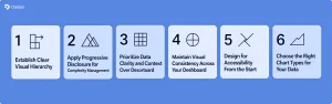
1. Establish Clear Visual Hierarchy
Visual hierarchy determines what users see first, second, and third, guiding their attention to the most critical information without conscious effort. The principle is simple: place your most important KPIs where users’ eyes naturally land first.
For left-to-right reading cultures, this means positioning critical metrics in the top-left corner of your dashboard. Studies on eye-tracking patterns confirm that users scan interfaces in an F-shaped pattern, spending the most time on upper-left content before moving right and down.
Use size, color, and visual weight strategically to reinforce hierarchy. Primary indicators should be larger and more prominent than supporting details. Group related metrics together so users don’t have to search across your dashboard to understand connections. For example, if you’re showing revenue performance, place total revenue at the top, followed by revenue trends over time, then drill-down details by product line or geography.
Effective hierarchy creates a narrative flow—answering the “what” (current state) before the “why” (underlying drivers) and “so what” (implications). This structure mirrors how executives actually process information during decision-making.
2. Apply Progressive Disclosure for Complexity Management
Progressive disclosure is the practice of showing only essential information upfront while making detailed data available on demand. This principle addresses one of the most common dashboard design mistakes: trying to display everything at once.
Think of progressive disclosure as layers of insight. Your dashboard’s initial view should answer the critical question: “Is everything okay?” Executive users should be able to glance at your dashboard and immediately understand performance status. If something requires attention, they can then drill down into specific metrics using filters, expandable sections, or interactive charts.
Implementation techniques include summary cards that expand on click, hover tooltips providing context without cluttering the interface, and hierarchical navigation that guides users from high-level overviews to granular details. A sales dashboard, for instance, might display total quarterly revenue prominently, with clickable elements that reveal regional breakdowns, individual rep performance, or product-specific trends.
Progressive disclosure benefits both novice and expert users. Executives get quick status updates without information overload, while analysts can explore deeper layers when conducting detailed investigations. This approach reduces cognitive load by up to 55%, according to Nielsen Norman Group research.
3. Prioritize Data Clarity and Context Over Decoration
Dashboard design exists to communicate insights, not to impress with visual flourishes. The most effective dashboards embrace functional minimalism, every element serves a purpose, and anything that doesn’t directly support comprehension is removed.
Unnecessary decoration, 3D charts, ornamental graphics, excessive gradients, actively harms usability by distracting users from the data itself. Research consistently shows that simple, clean designs outperform visually complex alternatives in both comprehension speed and decision accuracy.
Context transforms raw numbers into meaningful insights. A metric showing “$2.4M in monthly revenue” provides limited value without comparison points. Add context, “$2.4M monthly revenue (↑12% vs. last month, 95% of target)”, and suddenly users understand performance relative to expectations and trends.
Effective context strategies include showing current values alongside historical trends, displaying actual performance against targets or benchmarks, using color to indicate status (on-track, at-risk, critical), and providing legends that clarify what metrics represent. Every data point should answer not just “what is the number?” but “what does this number mean for our business?”
4. Maintain Visual Consistency Across Your Dashboard
Consistency reduces cognitive load by allowing users to apply learned patterns across different sections of your dashboard. When colors, fonts, layout structures, and interaction patterns remain predictable, users spend less mental energy decoding the interface and more energy analyzing insights.
Establish and document clear design standards: use specific colors consistently for specific meanings (green for positive, red for critical, blue for informational), apply the same chart types for similar data patterns, maintain uniform spacing and alignment throughout, and standardize labels and terminology.
Inconsistency creates confusion. If “Revenue” appears as “Sales” in one section and “Income” in another, users waste time verifying they’re looking at the same metric. If you use bar charts to show monthly trends in one widget but switch to line charts for the same data type elsewhere, you force users to relearn how to interpret information.
Visual consistency extends beyond individual dashboards. When you maintain design patterns across multiple dashboards within your organization, you create an ecosystem where users can transfer their understanding from one tool to another, dramatically reducing training requirements and adoption friction.
5. Design for Accessibility From the Start
Accessible dashboard design ensures that users with diverse abilities, visual impairments, motor disabilities, cognitive differences, can effectively interact with your data. Beyond ethical imperatives, accessibility improvements benefit all users by creating clearer, more intuitive interfaces.
Key accessibility principles include sufficient color contrast meeting WCAG 2.2 AA standards (4.5:1 for normal text, 3:1 for large text), keyboard-only navigation enabling users to access all features without a mouse, screen reader compatibility with proper semantic HTML and ARIA labels, and clear, legible typography using sans-serif fonts like Arial or Calibri.
Never rely solely on color to convey critical information. Users with color vision deficiencies may not distinguish between red and green status indicators. Supplement color with icons, patterns, or text labels. Ensure interactive elements have visible focus indicators so keyboard users understand their current position.
Accessibility also means designing for different cognitive processing styles. Some users prefer detailed tables, others respond better to visual charts. Providing multiple ways to access the same information accommodates diverse thinking patterns. Test your dashboards with assistive technologies and, when possible, with users who have disabilities to identify real-world usability barriers.
6. Choose the Right Chart Types for Your Data
Selecting appropriate visualizations is fundamental to dashboard effectiveness. Different chart types excel at different tasks, and choosing poorly can make even simple data difficult to interpret.
Bar and column charts work best for comparing values across categories or showing changes over discrete time periods. Use them when you need clear magnitude comparisons.
Line charts excel at displaying trends over continuous time periods, making patterns and inflection points immediately visible.
Pie and donut charts should be used sparingly—only when showing simple part-to-whole relationships with few segments (ideally 3-5).
Scatter plots reveal correlations between two variables but require more cognitive effort to process, making them better suited for analytical dashboards than executive summaries.
Heat maps efficiently display patterns across two dimensions, useful for showing performance across regions and time periods simultaneously.
Gauge charts effectively communicate single metrics relative to targets but consume significant space.
Avoid 3D charts entirely—the perspective distortion makes accurate value comparison nearly impossible. Similarly, resist overusing complex visualizations when simpler alternatives communicate the same insight more clearly.
The golden rule: choose visualizations that minimize the cognitive effort required to extract insights. If users must study a chart for more than a few seconds to understand the main point, you’ve chosen the wrong format.
UX Best Practices for Analytics Dashboards
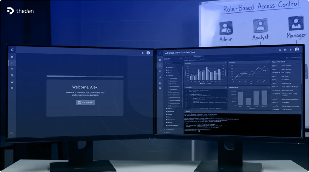
Design Role-Based Dashboard Experiences
Different users need different information to do their jobs effectively. A one-size-fits-all approach forces executives to wade through operational details while preventing analysts from accessing the granular data they need.
Three primary dashboard archetypes serve distinct purposes.
Strategic dashboards help executives monitor organizational KPIs and make long-term decisions, featuring high-level summaries, monthly or quarterly views, and focus on outcomes rather than processes.
Analytical dashboards enable data analysts to explore large datasets, identify trends, and answer “why” questions, incorporating complex visualizations, filtering capabilities, and drill-down features.
Operational dashboards support managers in monitoring real-time performance and daily operations, displaying current status, alerts for anomalies, and detailed process metrics.
Design your dashboard to match your primary user’s needs, or better yet, create customizable views that adapt based on user roles. A sales dashboard might show pipeline value and close rates to executives, activity metrics and conversion funnels to managers, and individual opportunity details to sales representatives—all drawing from the same data but presenting it differently.
Implement Real-Time Data Integration
Static dashboards that update weekly or monthly are increasingly inadequate for modern business needs. Real-time or near-real-time data integration enables organizations to identify and respond to opportunities and threats as they emerge.
Real-time dashboards particularly benefit operational monitoring (detecting system failures immediately), time-sensitive decisions (adjusting marketing spend based on campaign performance), and competitive scenarios where response speed matters. Research indicates that organizations implementing real-time dashboards see decision-making speed improvements of 20-30%.
However, real-time updates require thoughtful design. Users shouldn’t feel overwhelmed by constantly changing numbers. Use visual cues like subtle animations or color changes to draw attention to significant updates without creating distraction. Consider update frequency carefully—some metrics benefit from second-by-second updates (website traffic during a product launch) while others need only hourly or daily refreshes (monthly recurring revenue).
Ensure your dashboard clearly indicates when data was last updated. Timestamp visibility builds user confidence that they’re making decisions based on current information.
Optimize Dashboard Navigation and Information Architecture
Dashboard navigation should be intuitive enough that first-time users can find what they need without training. Poor navigation structures are among the most common UX mistakes, forcing users to hunt for critical information.
Group related metrics logically, using consistent categorization across your dashboard. If you organize by business function (Sales, Marketing, Operations), maintain that structure throughout. If you organize by objective (Acquisition, Retention, Revenue), apply that lens consistently.
Provide clear wayfinding elements: a persistent sidebar or top navigation showing available views, breadcrumb trails indicating the user’s current location, and intuitive labels using language familiar to your users. Avoid technical jargon when business terminology would be clearer.
For complex dashboards with multiple views, implement a search function allowing users to quickly locate specific metrics or reports. Include “favorites” or “bookmarks” functionality so users can personalize their dashboard experience by marking frequently accessed views.
Balance White Space and Information Density
White space, the empty area between elements—is not wasted space. It’s a critical design element that reduces visual clutter, improves comprehension, and guides user attention.
Too little white space creates cramped, overwhelming interfaces where everything competes for attention and nothing stands out. Too much white space forces excessive scrolling and makes it harder to see related metrics together. The optimal balance depends on your dashboard type—executive dashboards can afford more white space to emphasize key metrics, while operational dashboards may require higher information density to minimize navigation.
Use white space strategically to group related elements and separate distinct concepts. Consistent spacing creates visual rhythm that makes dashboards easier to scan. Margins around charts, padding within cards, and gaps between sections all contribute to improved readability.
Consider how your dashboard will be consumed. Desktop users can handle more information density than mobile users. Users who check dashboards briefly throughout the day benefit from more compact layouts, while those conducting deep analysis prefer more breathing room around visualizations.
Make Your Dashboard Mobile-Responsive
Mobile and tablet usage for business intelligence tools is projected to exceed 60% of enterprise BI usage in 2026, according to Gartner research. Executives checking performance metrics between meetings, sales representatives reviewing pipeline during client visits, and managers monitoring operations from the field all require mobile-optimized dashboard experiences.
Mobile dashboard design requires different approaches than desktop design. Prioritize the most critical 3-5 metrics that users need on-the-go, use larger touch targets (minimum 44×44 pixels) for interactive elements, implement swipe gestures for natural navigation, and design for vertical scrolling rather than complex multi-column layouts.
Responsive design doesn’t mean simply shrinking your desktop dashboard to fit smaller screens. It means reimagining the information hierarchy for constrained screen space. Consider providing simplified mobile views that link to fuller desktop experiences for detailed analysis.
Test your dashboard on actual devices—not just browser emulation—to ensure touch interactions work smoothly, text remains legible, and charts display clearly at various screen sizes.
Common Dashboard Design Mistakes to Avoid
Mistake 1: Displaying Too Many KPIs Simultaneously
The temptation to include every conceivable metric creates dashboards that tell no story and support no specific decision. When everything is highlighted, nothing stands out. Users face analysis paralysis rather than gaining actionable insights.
Limit your dashboard to 5-9 primary metrics that directly support specific decisions or goals. If you find yourself including a metric “just in case someone might want it,” that metric probably doesn’t belong. Every KPI should answer a specific question your users regularly face.
For comprehensive monitoring needs, create multiple focused dashboards rather than one overwhelming view. A marketing team might maintain separate dashboards for acquisition, engagement, and retention rather than cramming all metrics into a single interface.
Mistake 2: Designing Without Understanding User Needs
Starting dashboard design before understanding what decisions users need to make leads to beautiful interfaces that nobody uses. The most common manifestation: dashboards designed around available data rather than user questions.
Effective dashboard design begins with user research. Interview your stakeholders to understand what decisions they make regularly, what information would help them act more confidently, how they currently gather that information, and what frustrations they experience with existing tools.
Design dashboards to answer specific questions, not just display data. A customer success dashboard might be designed to answer: “Which accounts are at risk of churning?” “What’s driving our NPS score?” “How quickly are we resolving support tickets?” Each question then dictates which metrics to display and how to visualize them.
Mistake 3: Ignoring Performance and Load Time
Dashboards that take 10-20 seconds to load or that freeze when users apply filters create frustration that undermines trust in the data. Performance issues signal to users that the dashboard isn’t reliable for time-sensitive decisions.
Optimize dashboard performance by loading critical metrics first before secondary details, implementing caching for frequently accessed queries, limiting default data ranges to reasonable timeframes, and providing clear loading indicators so users understand when data is updating.
For dashboards with heavy data processing requirements, consider pre-aggregating data during off-peak hours rather than calculating everything on-demand. Users rarely need real-time precision for historical trend analysis.
Performance particularly matters for mobile users on potentially slower connections. Test your dashboard under various network conditions to ensure acceptable performance.
Mistake 4: Using Color Ineffectively
Color is powerful for communicating status and drawing attention, but misused color creates confusion. Common mistakes include using too many colors that create visual chaos, inconsistent color meanings (red indicates “bad” in one chart but simply denotes a category in another), and relying solely on color without text or icon reinforcement.
Establish a clear color system: use 2-3 status colors (green for positive/on-track, yellow for caution, red for critical), employ neutral colors (grays, blues) for non-status information, and reserve bright colors for elements requiring immediate attention. Ensure sufficient contrast between colors and backgrounds for accessibility.
Test your color choices with colorblindness simulators to ensure critical distinctions remain visible to users with color vision deficiencies.
Mistake 5: Neglecting Mobile and Cross-Device Experiences
Designing exclusively for desktop screens ignores how modern executives and managers actually work. Yet many organizations still deploy dashboards that are unusable on tablets and phones, forcing mobile users to pinch-zoom and scroll endlessly.
This mistake becomes particularly costly when decision-makers need information outside the office. A CEO reviewing quarterly results from home, an operations manager checking production metrics from the factory floor, or a sales leader monitoring team performance during a conference all require mobile-optimized experiences.
Adopt a mobile-first design approach: start with the mobile layout, identifying the absolute essential metrics that must be accessible on small screens, then progressively enhance for larger displays rather than attempting to shrink desktop layouts. This forces prioritization that often improves the desktop experience as well.
Real-World Examples: Dashboard Design in Action
Enterprise Reporting: Scoop’s Transportation Dashboard
When Scoop, a carpooling platform serving eleven Fortune 100 companies, built their first enterprise reporting dashboard, they faced a complex challenge: enabling customer administrators to monitor transportation programs while managing user access.
Their UX approach prioritized user management as the foundational feature—specifically, allowing customers to remove terminated employees from carpool benefits. This decision was driven by pending contracts that required this capability before signing. The design team conducted concept testing with actual customers, discovering that executives preferred having performance graphs on separate pages accessed via sidebar navigation rather than cramming everything onto a single scrolling page.
The result: a role-based dashboard where administrators could quickly identify program usage, performance metrics provided clear visibility into carpooling trends, and reporting features delivered insights without requiring customer success team intervention. The user-centered approach, including multiple rounds of testing before development, ensured the dashboard addressed real needs rather than assumed requirements.
Customer Experience Analytics: ForeSee’s Customizable Dashboard
ForeSee’s CX Suite dashboard project demonstrates how customization capabilities transform data visualization from rigid reporting to flexible insight generation. Their challenge: clients needed multiple unique views of customer experience data for various roles and user groups within their organizations.
The design team’s mission was finding the right balance between simplicity and flexibility without recreating complex business intelligence tools. They implemented a system allowing users to create, customize, and share dashboards with different visualizations of the same data segment—eliminating cumbersome navigation and repetitive filtering.
Their early testing strategy proved critical. Given the project’s scale and complexity, they validated designs with clients as early as possible, conducting two rounds of testing as designs evolved. This iterative approach prevented costly late-stage corrections and ensured the final product matched user mental models.
Financial Services: BlackRock’s Data Accessibility Transformation
BlackRock’s implementation of visualization tools illustrates the ROI potential of well-designed dashboards. By improving data accessibility by 40%, they enabled portfolio managers to make informed decisions using up-to-the-minute analysis.
The transformation centered on replacing manual reporting processes with real-time dashboards that integrated multiple data sources into unified views. Portfolio managers could instantly spot emerging risks, identify opportunities across markets, and adjust positions based on current rather than stale information.
The measurable impact extended beyond speed. Deloitte’s similar initiative cut data analysis time by 30%, allowing teams to shift focus from data gathering to strategic initiatives. These examples demonstrate that dashboard design ROI comes not just from faster decisions but from redirecting professional time toward higher-value activities.
Latest Trends in Dashboard and Data Visualization Design
AI-Powered Personalization and Predictive Analytics
Artificial intelligence is transforming dashboards from passive displays into active decision support systems. Modern AI-powered dashboards learn user preferences and adapt presentations based on individual behavior patterns.
Machine learning algorithms analyze how users interact with data—which metrics they check most frequently, what time ranges they typically explore, what drill-down paths they follow—and automatically surface relevant insights. Rather than forcing every user to navigate the same interface, AI-personalized dashboards present role-specific views that evolve with changing user needs.
Predictive analytics capabilities move dashboards beyond historical reporting. Instead of showing “revenue declined 5% last quarter,” predictive dashboards forecast “based on current pipeline, we project 8% revenue decline next quarter unless conversion rates improve”. This shift from descriptive to prescriptive analytics enables proactive rather than reactive decision-making.
Power BI’s Copilot integration exemplifies this trend, allowing users to ask natural language questions and receive contextual insights without building complex queries. As AI continues maturing, expect dashboards to proactively alert users to anomalies, recommend actions, and even automatically adjust business processes based on data patterns.
Embedded and White-Label Dashboard Experiences
Organizations increasingly embed analytics directly into operational workflows rather than requiring users to switch to separate BI tools. This embedded analytics approach delivers insights within the context where decisions happen—CRM systems, project management platforms, customer portals.
For SaaS companies, white-label dashboards enable them to offer analytics as product features rather than separate tools. A project management platform might embed resource utilization dashboards, a marketing automation tool might integrate campaign performance analytics, or a financial services application might provide investment portfolio dashboards—all branded consistently with the host application.
The UX implications are significant. Embedded dashboards must respect host application design patterns while maintaining data visualization best practices. They often operate under tighter space constraints than standalone dashboards, requiring even more disciplined prioritization.
API-driven dashboard architectures enable this flexibility, allowing organizations to integrate analytics across diverse systems while maintaining single-source-of-truth data accuracy.
Mobile-First and Multi-Device Dashboard Experiences
The shift toward mobile-first design reflects changing work patterns. Executives expect to monitor KPIs during their commute, sales teams need pipeline visibility during client meetings, and operations managers must respond to alerts regardless of location.
Mobile-first design forces beneficial constraints. When you must identify the 3-5 metrics that matter most on a phone screen, you eliminate nice-to-have clutter that weakens desktop dashboards. This discipline often improves the overall information architecture.
Advanced implementations extend beyond responsive layouts to create platform-specific experiences. Mobile dashboards might emphasize notifications and quick status checks, tablet versions might support deeper exploration with touch-optimized drill-downs, and desktop versions might offer comprehensive analysis tools and multi-dashboard comparisons.
Smart watch and voice-activated devices represent emerging frontiers. Imagine checking critical KPIs via smart watch glance or asking “What’s today’s revenue?” and receiving voice responses from your dashboard. These modalities require fundamentally reimagined interaction models focused on ultra-concise information delivery.
Immersive Data Visualization with AR and Spatial Computing
Augmented reality and spatial computing are moving from experimental to practical for specific dashboard use cases. Rather than viewing data on flat screens, spatial interfaces enable users to arrange, scale, and interact with visualizations in three-dimensional space.
For complex multi-dimensional data, spatial visualization can reveal patterns impossible to detect in traditional 2D charts. A supply chain dashboard might display global operations as an interactive 3D map where users can “walk through” facility performance, a financial dashboard might present portfolio components as spatial objects that users can manipulate and compare, or a product analytics dashboard might visualize user journeys as spatial flows through feature landscapes.
Practical applications are emerging in industries where spatial understanding matters inherently, real estate analytics showing property data in geographic context, manufacturing dashboards overlaying equipment performance metrics onto facility layouts, or retail analytics displaying store performance within mall configurations.
The technology still faces adoption barriers—hardware requirements, learning curves, and development complexity—but falling costs and improving tooling are expanding viability. For organizations working with inherently spatial data or seeking differentiation through innovative experiences, AR-enabled dashboards warrant exploration.
Emphasis on Ethical Design and Data Transparency
Growing awareness of data privacy and algorithmic bias is driving demand for transparent, ethical dashboard design. Users increasingly question not just what data shows but how it was collected, what’s included or excluded, and what assumptions underlie calculations.
Ethical dashboard design includes clearly indicating data sources and collection methods, exposing confidence levels and margins of error, acknowledging known limitations or biases in datasets, and providing audit trails showing how metrics are calculated.
This transparency builds trust while protecting organizations from misinterpretation-driven bad decisions. When executives understand that a metric has 15% margin of error or that certain customer segments are underrepresented in the dataset, they make more nuanced decisions than if they treat all numbers as equally reliable.
Privacy-centric design also matters, particularly for dashboards handling personal information. Implement role-based access controls ensuring users see only data appropriate to their responsibilities, anonymize or aggregate data to protect individual privacy, and clearly indicate when dashboards contain sensitive information requiring careful handling.
How Expert Dashboard Design Improves Decision-Making and ROI
Accelerating Time-to-Insight
The most immediate benefit of expert dashboard design is speed. Well-designed dashboards answer critical business questions in seconds rather than requiring hours of data wrangling. This acceleration compounds across an organization—when hundreds of employees make dozens of data-informed decisions daily, even small time savings generate substantial productivity gains.
Consider a retail business during holiday season. Instead of waiting until week’s end to evaluate promotion performance, real-time dashboards enable pricing and inventory adjustments immediately based on morning data. One retail client achieved a 25% holiday revenue increase simply by having the visibility to act faster than competitors.
Time savings extend beyond decision speed to report preparation. Organizations implementing comprehensive dashboards typically recover 40-60% of time previously spent on manual data collection and report creation. This efficiency improvement allows data teams to shift from report generation to strategic analysis—higher-value work that drives competitive advantage.
Improving Decision Quality and Reducing Errors
Speed without accuracy is dangerous. Expert dashboard design improves both dimensions by presenting data in formats that align with human cognitive processing.
Visual representations reduce interpretation errors compared to tables of numbers. When you can see revenue trending downward across a line chart, the pattern registers immediately. The same data in spreadsheet rows requires more cognitive effort to process, creating opportunities for misinterpretation.
Contextual insights prevent common analytical mistakes. Without context, a metric showing “15% customer churn” provides limited guidance. Is 15% good or bad? Improving or worsening? A well-designed dashboard adds context automatically—”15% churn (↑3% vs. last quarter, industry average: 12%)”—enabling accurate interpretation without requiring users to manually gather comparison data.
Organizations implementing effective dashboards report significant reductions in costly errors driven by incomplete information or misunderstood metrics. When everyone operates from a shared, accurate view of performance, alignment improves and execution becomes more effective.
Enabling Organizational Agility
Market conditions change rapidly. Organizations that can identify and respond to shifts faster than competitors create sustainable advantages. Dashboard design directly impacts organizational agility by democratizing access to insights.
When critical information flows freely across teams, bottlenecks disappear. Marketing can adjust campaigns based on real-time conversion data, product teams can prioritize development based on usage analytics, and customer success can proactively address satisfaction trends before churn occurs—all without waiting for data team intervention.
Companies with top-quartile dashboard effectiveness significantly outperform bottom-quartile companies on both internal operational metrics and external market performance. The correlation isn’t coincidental—organizations that can act on information faster execute strategies more effectively.
Real-time strategic management replaces quarterly reporting cycles. Instead of discovering three months later that a strategy underperformed, modern dashboards provide continuous visibility that enables course corrections when interventions still matter.
Delivering Measurable Return on Investment
Dashboard implementation requires investment—platform costs, design and development services, training, and ongoing maintenance. Yet the ROI typically becomes apparent within months rather than years.
Quantifying dashboard ROI involves multiple factors: time savings value calculated as hours saved per week multiplied by hourly wage rates, decision speed improvements measured as revenue impact from faster responses to opportunities and threats, error reduction quantified as cost of poor decisions prevented, and efficiency gains from operational improvements.
Real-world examples illustrate the business case. A regional marketing agency invested $18,000 in Power BI implementation and setup, achieving 50% reduction in client reporting time, 30% faster campaign optimization, and 25% increase in client retention—delivering 280% ROI in year one. A medical practice invested $8,000 in Tableau dashboard development, resulting in 25% reduction in patient wait times, 18% increase in daily patient capacity, and $180,000 additional annual revenue—with a 2.5-month payback period.
These aren’t outlier success stories. When implemented correctly, dashboard initiatives typically deliver measurable ROI within 3-6 months, with benefits accelerating as adoption matures and users become more sophisticated in leveraging available insights.
Getting Started: Actionable Steps for Better Dashboard Design
Building effective dashboards begins with clarity about purpose. Before opening design tools, answer fundamental questions: What decisions will this dashboard support? Who will use it and what’s their technical sophistication? What are the 3-5 most critical questions users need answered?
Start with user research, not data exploration. Interview stakeholders to understand their current decision-making processes, pain points, and information needs. Observe how they currently gather and analyze data—their workarounds often reveal opportunities for dashboard features.
Create wireframes and lo-fidelity prototypes before investing in development. Test these early concepts with actual users, gathering feedback on information hierarchy, metric relevance, and interaction patterns. This validation prevents costly late-stage corrections when development is underway.
Choose appropriate technology platforms based on your requirements—data sources, user count, customization needs, and budget constraints. Popular options include Power BI for Microsoft ecosystem integration, Tableau for complex visualization requirements, and specialized SaaS analytics platforms for specific use cases.
Implement iteratively rather than attempting comprehensive launches. Start with one high-value use case and a focused user group. Gather feedback, refine based on actual usage patterns, then expand to additional use cases and users. This approach builds organizational buy-in while managing implementation risk.
Measure adoption and impact. Track metrics like daily active users, time spent on dashboards, and most-accessed views to understand what works. More importantly, measure business outcomes—decision speed improvements, error reductions, and efficiency gains—to quantify ROI and justify continued investment.
Ready to transform your data visualization strategy?
Partner with UX/UI design experts who understand both the principles of effective dashboard design and the unique needs of data-driven organizations. Our team specializes in creating analytics experiences that turn complex information into clear, actionable insights—driving better decisions at every level of your business.